SafetyHQ
SafetyHQ (formerly Harness) streamlines safety protocols, enabling construction crews to work safer and more efficiently.
Overview
The SafetyHQ app (formerly Harness) is used by companies in the construction trades to better manage their health & safety programs. The software enables construction companies to better train their workers and manage day-to-day safety tasks. In addition, clients using Harness are able to quickly gain meaningful insights on where they can improve safety so they can easily save time and lower costs.
SafetyHQ already had a working product and needed help on the UX/UI front. They had a number of features and interfaces that needed UX improvements, as well as prepared design deliverables for their developers.
The Challenge
Informing safety directors with data-driven reports
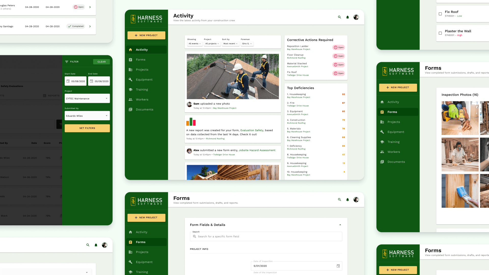
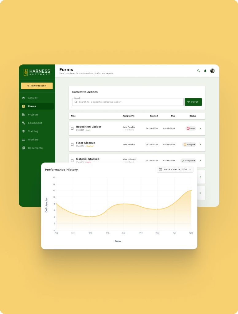
I worked closely with SafetyHQ on revising the UI/UX for several of their existing features – from navigation to forms, layout, hierarchy, etc.
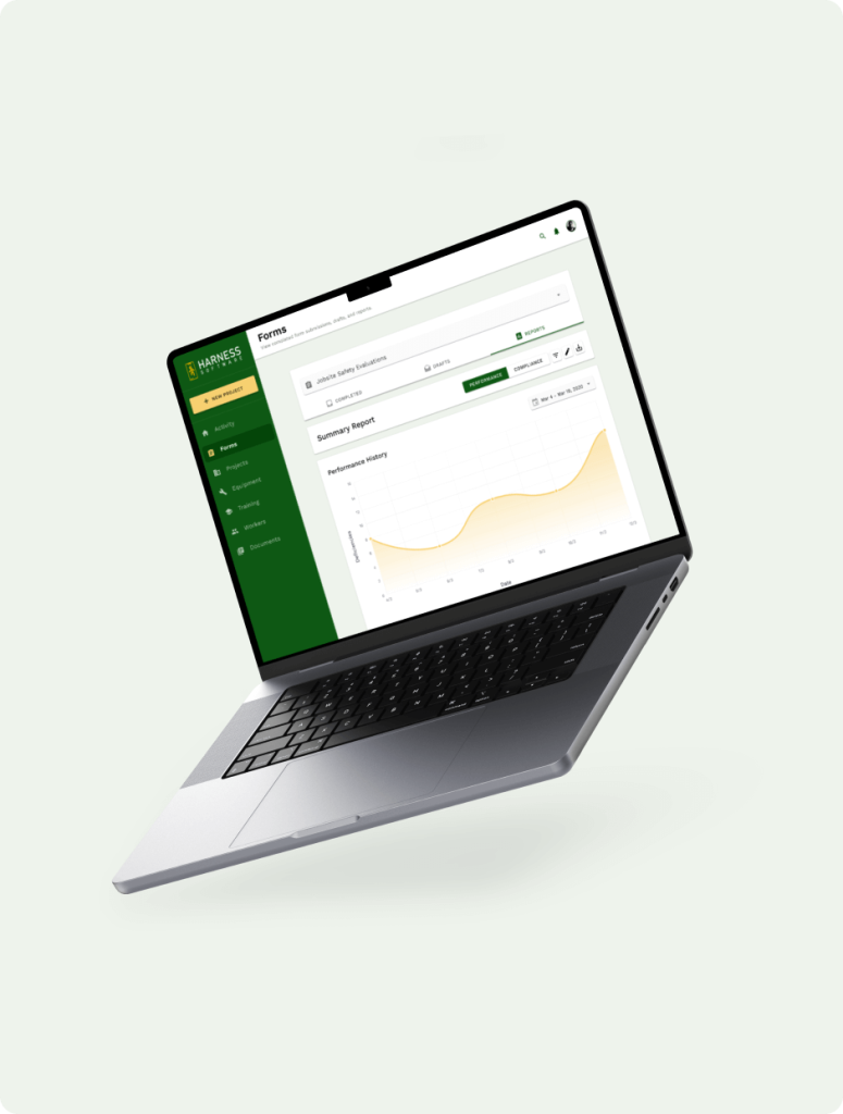
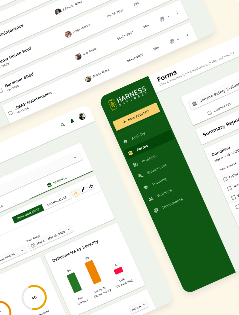
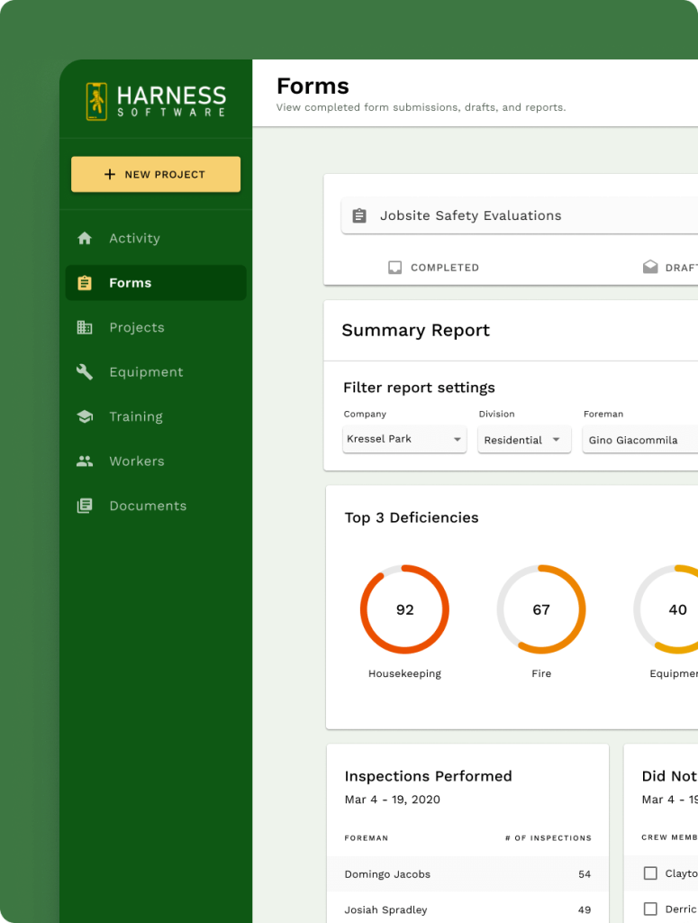
In addition, I helped conceptualize new features for their product, such as summarized reports allowing key personnel to easily keep track of inspections, deficiencies, and to ensure that their construction crews were meeting its reporting obligations.
Demystifying the end users & flows
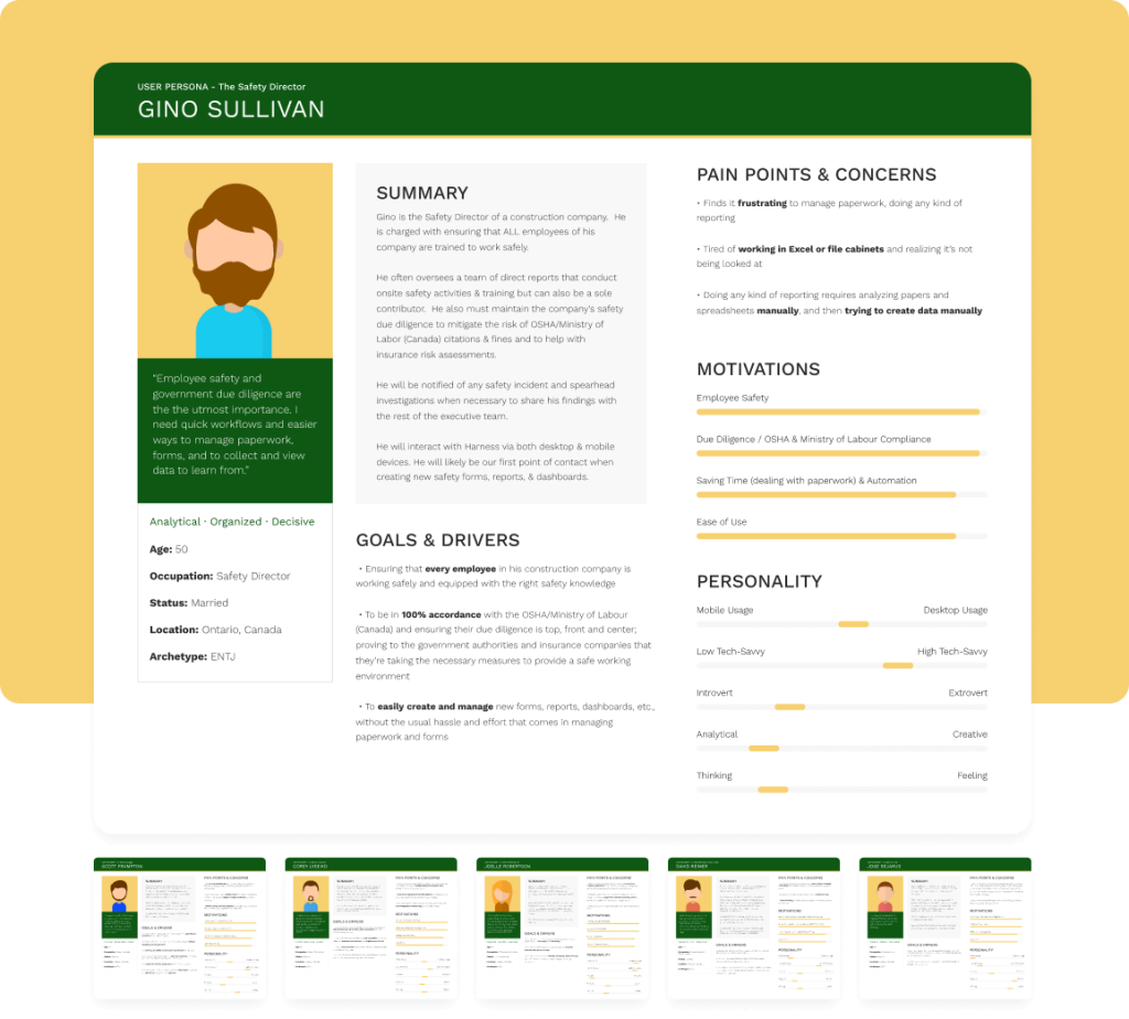
Design is a medium to solve business problems, all while keeping its end users’ goals in mind. It was important to understand the mindsets of the customers so that I could start building the right UX to satisfy their needs.
I created a series a personas based on assumptions of customer behavior, as well as speaking directly to the founder about who their customers were and what their goals were for using the app. This helped us align on who we were designing for.
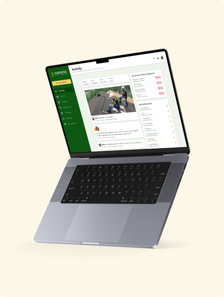
Project timelines, activity feeds, and statuses
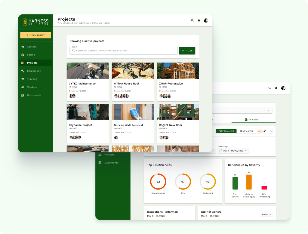
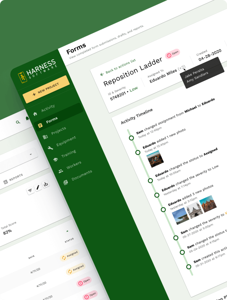
During my time at SafetyHQ, I helped design timelines, activity feeds, statuses, project indicators, and more.
Knowing what happened, when, and by who; these turned out to be critical parts of any construction or trades-based project, and directors wanted a clear and easy way to quickly identify an event, inspection, or general update from a project.
Simplifying the experience for the non-technical
The original product experience was confusing, outdated, and overall difficult to use. The people using SafetyHQ were often working in the trades such as roofing, electrical, or mechanical roles.
As such, the software needed work on being accessible, as well as dozens of micro UX and UI refinements that made it easy for the average, non-technical user to accomplish their daily tasks and goals.
