Brendan HoThoughts·
Stop designing for the demo
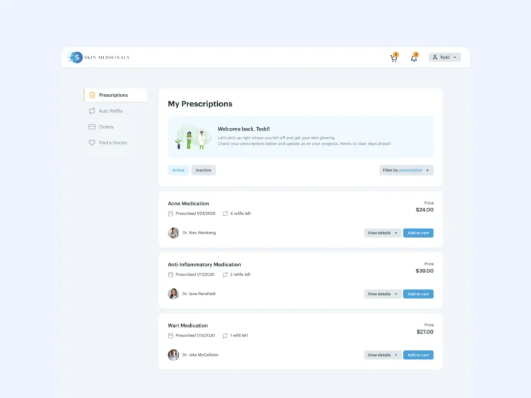
The screens that close deals are rarely the screens users live in. Dashboards demo well. Settings, tables, and empty states are where products are actually won.
Short posts on SaaS UX, product design, AI, and the tools in between.
The screens that close deals are rarely the screens users live in. Dashboards demo well. Settings, tables, and empty states are where products are actually won.
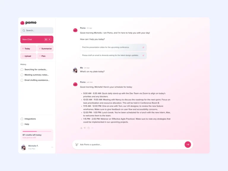
A spinner says something is happening. A status line that says searching your documents, reading 12 matches, drafting summary says the right thing is happening.
If your component library is not making this week's feature faster to design and build, it is a museum, not a system.
UX patterns for AI agents: delegation, supervision, interruption, and the trust signals that make autonomous features feel safe.
I tried a lot of new tools this year. Four survived daily use: Figma for everything visual, Claude for thinking and drafts, Linear for tracking, Notion for memory.
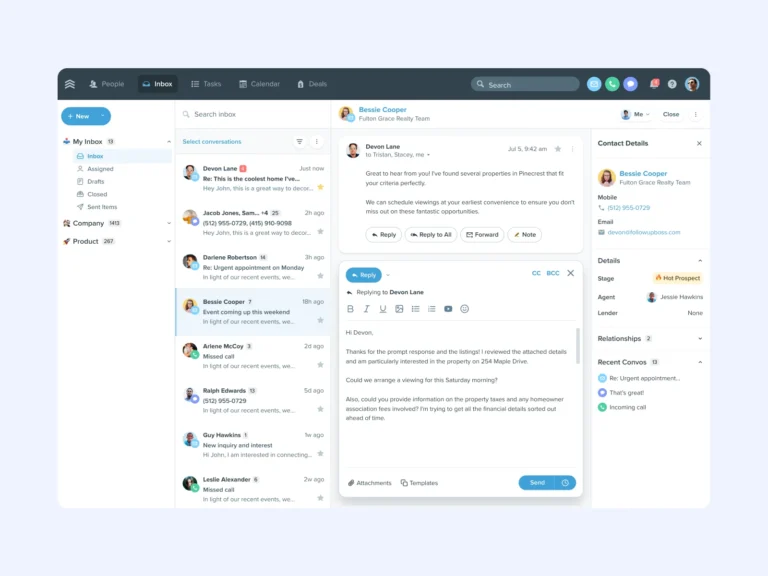
The most common UX reasons users churn from B2B SaaS products, and the design fixes that keep them around.
Users do not abandon products because they missed a tooltip. They abandon because nothing valuable happened in the first session.
Users will not delegate to a system they cannot supervise. Scope preview, legible progress, and easy undo are the load-bearing patterns.
Model responses take seconds, not milliseconds. These streaming and progressive-rendering patterns keep AI products feeling responsive.
A practical checklist for designing every state of every screen: the difference between a mockup and a dev-ready design.
No posts match that yet. Try a different search or category.
AvailableThink there’s potential for us to work together?
Tell me what you’re building and where design is slowing you down. If there’s a fit, I’ll show you exactly how I can help.