
Token-based foundations
Color, type, spacing, and radius tokens with light and dark theming built in, structured to map cleanly to code.
Design Systems & Tokens
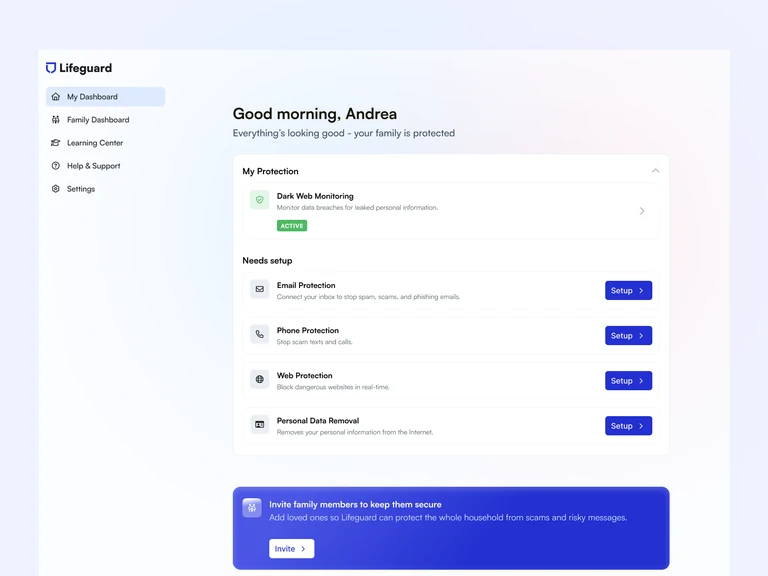
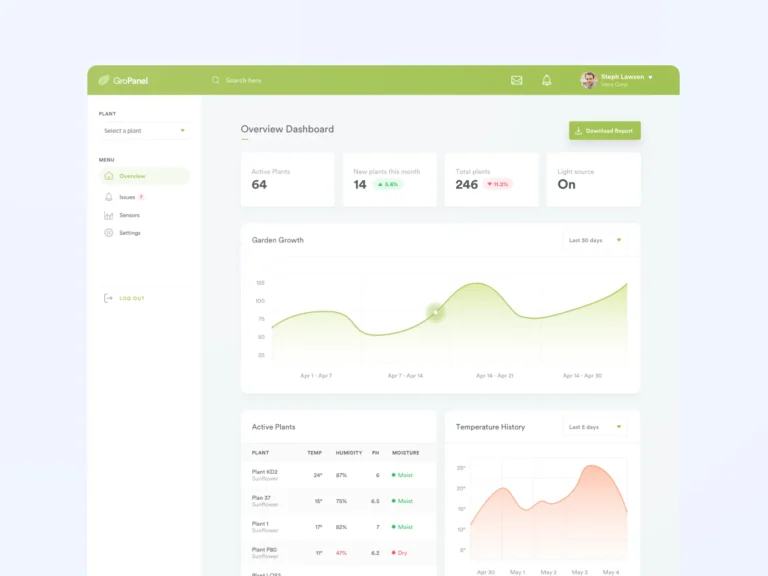
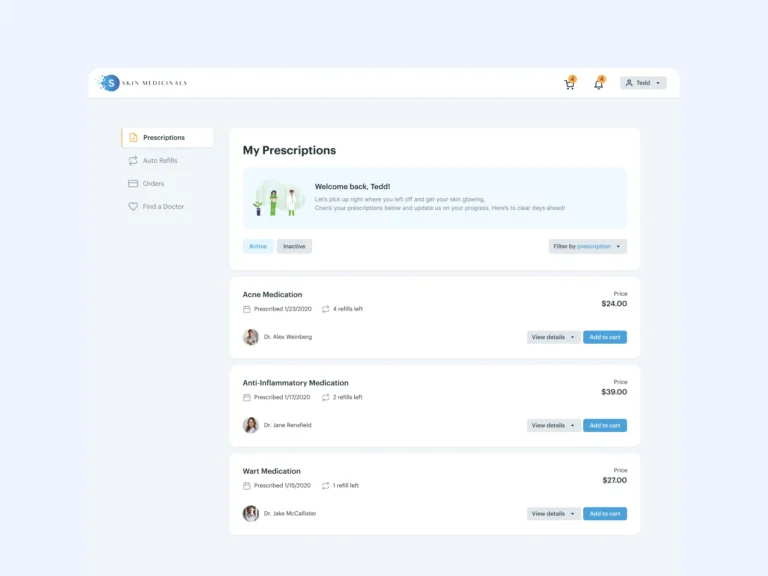
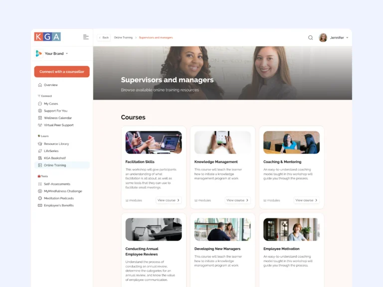
I organize your scattered components into a design system built on variables and tokens, with states and documentation that help enterprise teams build consistent UI by default.
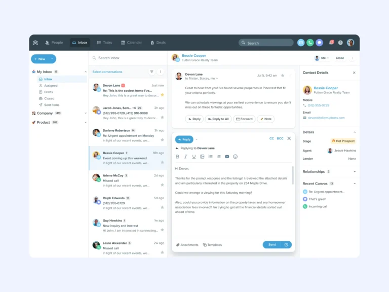

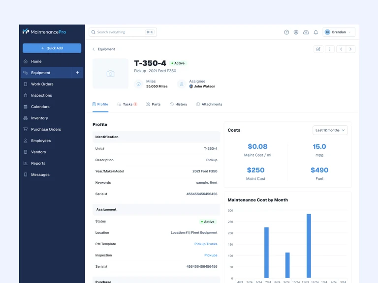
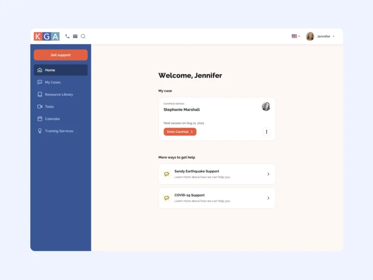
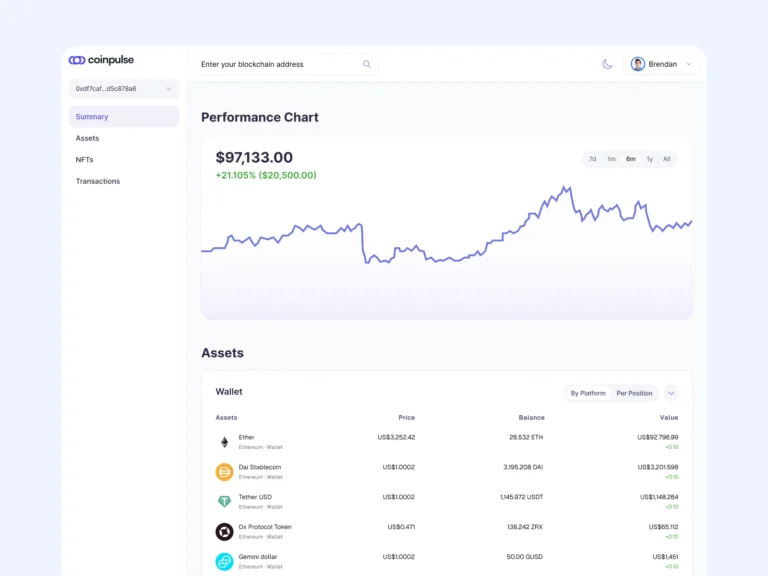
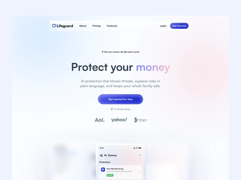
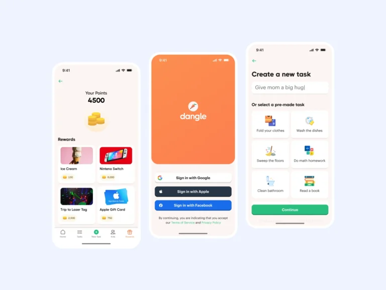
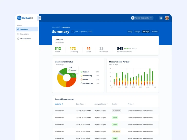
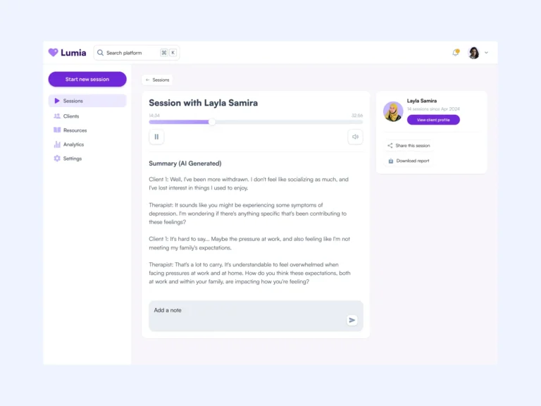
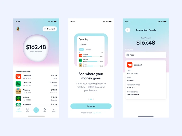
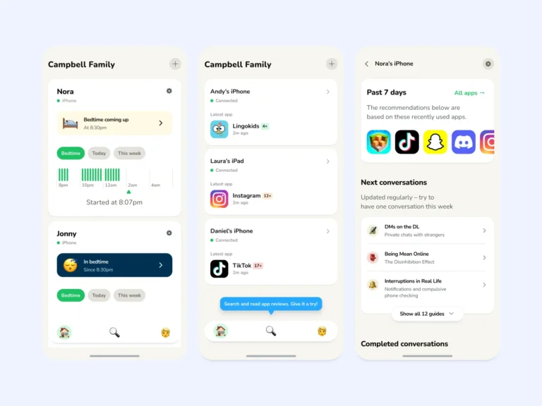
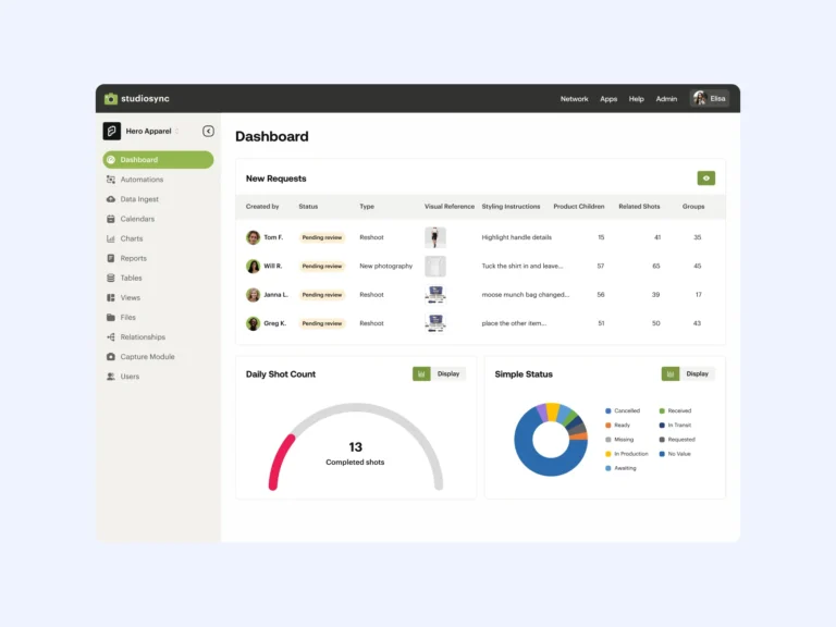
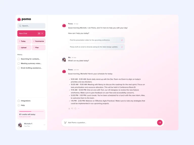
Deliverables
Color, type, spacing, and radius tokens with light and dark theming built in, structured to map cleanly to code.
Variant-complete Figma components with states and sizes, so new screens look right by default.
Usage guidance written for designers and developers, not a wiki nobody opens twice.
Duplicates consolidated, inconsistencies resolved, and your files migrated to a maintainable structure.
Engineers stop rebuilding the same button; every component maps predictably to the codebase.
Every future feature inherits the system, so the product gets more coherent as it grows, not less.
Best suited to
For teams whose product grew faster than their component library.
Multiple designers and squads shipping in parallel, each drifting a little further from a shared look.
Seventeen button styles, four blues, and a Figma file only one person can navigate.
You are about to add designers or squads and want the foundations in place before the sprawl starts.
Engagement fit
The process
From audit to a system your team actually adopts.
Every component, color, and text style inventoried, so we know exactly what to keep, merge, and retire.
Tokens for color, type, spacing, and radius, with light and dark theming structured to match your codebase.
Variant-complete components with states and sizes, assembled screen-first so the system serves real work.
Usage docs, file organization, and a migration path your team can follow without stopping delivery.
Testimonials
“Design concepts and explorations are where Brendan shines! I would describe the problem, and he would draw up three or four ways to solve it. He is open to feedback and takes direction well. One of the things I like best about his designs are the annotations in the margins that explain his perspective or reasoning for certain elements.
Final designs are well organized, which helps our team quickly find what we need, especially when we need to refer back to them later.”
 Lisa M.VP Product, Combinaut
“Brendan is a rockstar! Provides quick, clean, easy to understand layouts that developers find useful and actionable. We’ve worked on websites and apps together and were extremely satisfied with the end results. A clear communicator and punctual, we look forward to working with Brendan again everytime.”
 Yanier G.Founder, Destructoid
FAQs
Yes. If you already have a system, I audit inconsistencies, consolidate duplicates, and migrate your files to a maintainable structure rather than starting over.
That is the goal from day one. Tokens are named and structured to translate cleanly into CSS variables or your theming layer, and I work with your developers to keep the mapping honest.
Documentation is written for daily use, components carry their guidance with them, and the rollout includes walkthroughs with your designers and developers so adoption starts immediately.
I use Figma for all design work – it’s versatile and perfect for collaborative efforts.
The next step is to reach out through my contact form and book a (video) call. This will help us see if we’re a good fit for each other. 😊
 Available
Hey! Has your UI drifted into seventeen button styles?
Tell me about your product and team. I’ll turn the scatter into a system every new screen inherits.