
Enhancing the UX/UI for Charitable eCommerce
 Bren from SaaS Designer
Prior to my quick redesign, GiveBackStore lacked any substantial UX or UI elements. The platform was in its most basic form, essentially starting from scratch with a bare-bones interface that offered minimal user engagement or visual appeal.
I focused on transforming the “products” and “checkout” pages to enhance user experience and drive engagement.
To create a more inviting atmosphere, I utilized a calming color palette of cream and off-white tones.
I updated the hero typography and established a clear hierarchy on the product catalog, making it easier for users to navigate and find what they need.
For the checkout page, I implemented a complete rework, adopting a 2-column layout that streamlined the process. This included adding clear affordances to the fields and reducing friction for users when filling out billing and shipping details, resulting in a more intuitive and efficient checkout experience.
Product Overview
GiveBackStore is an eCommerce platform designed to facilitate fundraising by selling basic household items. The proceeds from these sales are directed towards providing essential resources like water and food to underserved communities.
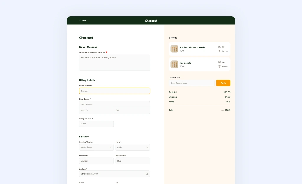 After
After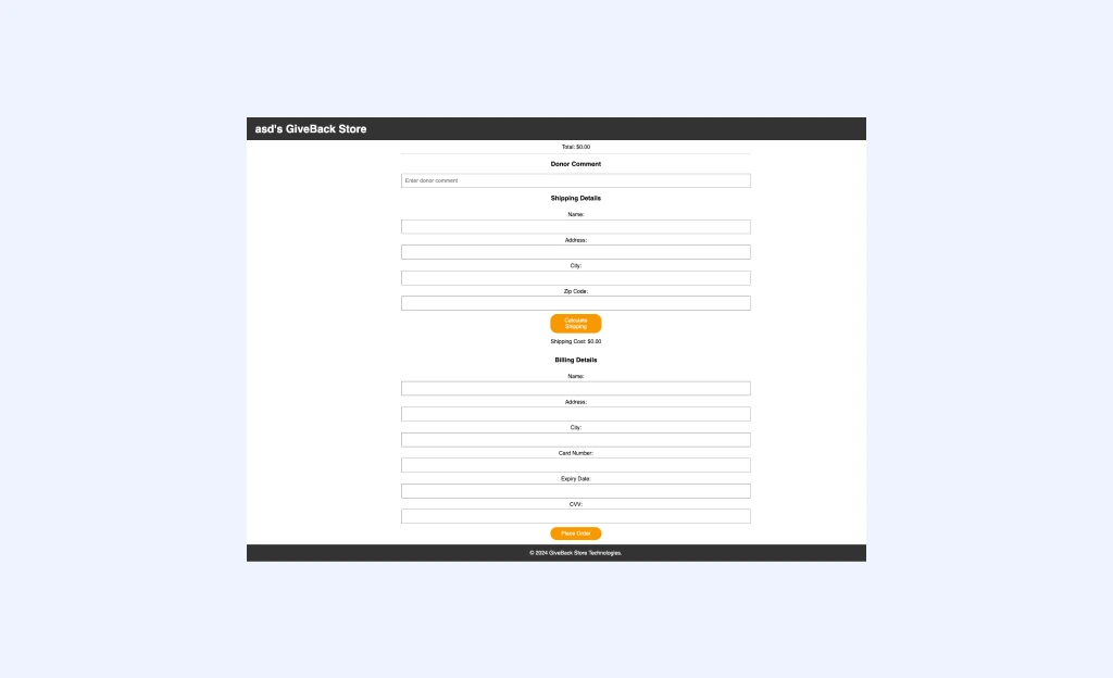
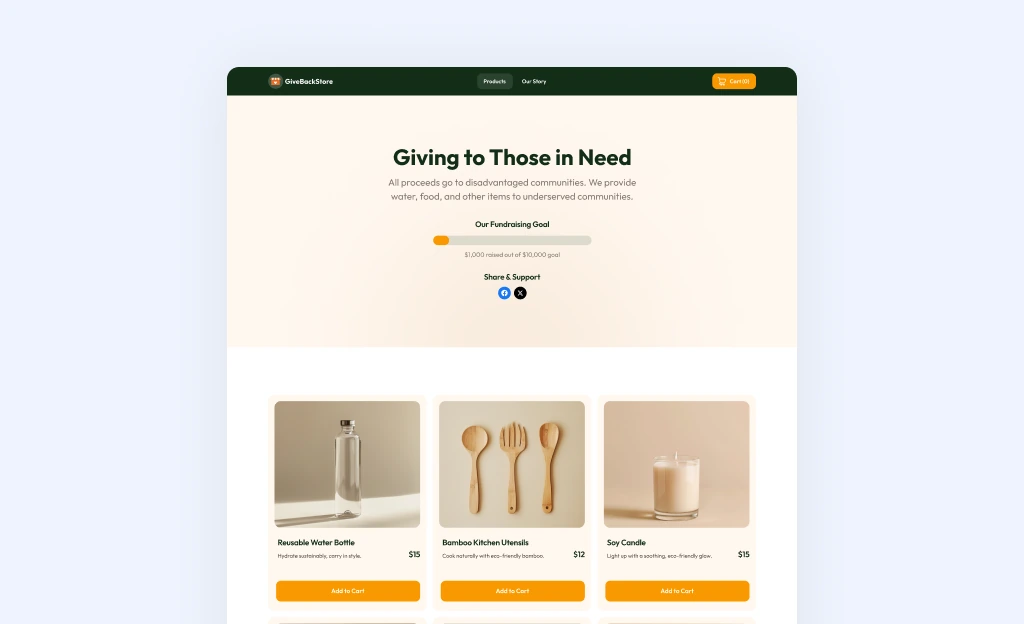 After
After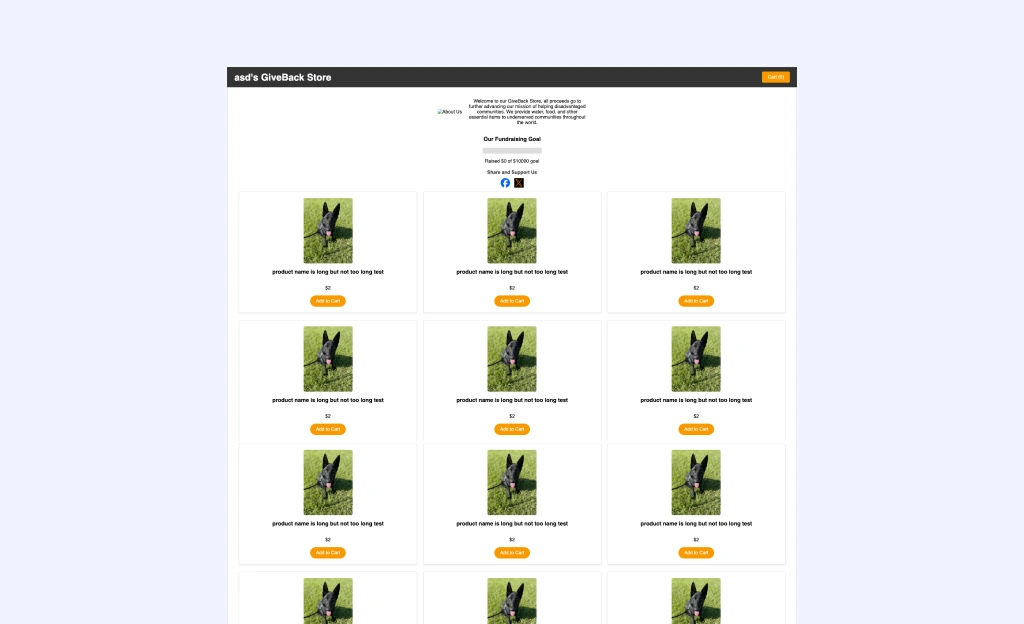
Summary
The enhanced product and checkout pages not only improved the overall user experience but also increased the likelihood of successful transactions, thereby boosting the store's ability to provide for disadvantaged communities.