
UI Design Refresh for a Studio Platform SaaS to Improve User Experience
 Bren from SaaS Designer
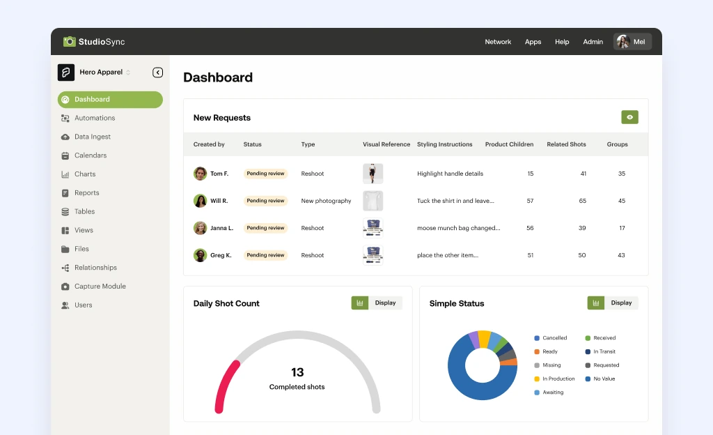
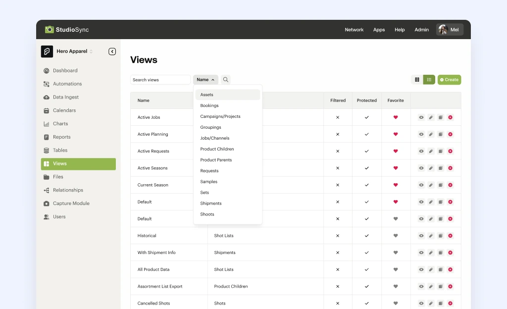
The initial UI of StudioSync was outdated and uninviting, with a dashboard and tables that lacked vibrancy and modern appeal. Users struggled with confusing and complex data presentations, making it difficult to comprehend and read essential information.
The typography and hierarchy were disorganized, resulting in a chaotic visual structure. Additionally, the charts and tables resembled generic clip art, failing to align with the overall aesthetic and professional standard expected by users.
Focusing exclusively on UI enhancements, I undertook several targeted improvements to modernize StudioSync’s interface.
I began by developing a comprehensive color palette, incorporating more brand colors to create a cohesive and appealing visual experience.
To address the typography issues, I established a clear hierarchy system, ensuring a structured and readable presentation of information. I improved the spacing and breathing room within the tables and dashboard elements, making the interface more user-friendly and visually pleasing.
To enhance usability, I designed a collapsible sidebar tailored to the needs of studio owners, allowing for easy switching between studios.
Colored labels were introduced to indicate the status of requests, providing immediate visual feedback.
Finally, I simplified the dashboard charts, making them more intuitive and aligned with the new design aesthetic.
Product Overview
StudioSync is an innovative platform crafted to streamline and automate the photography production workflow for brands and studios. By centralizing the management of product data, photography tasks, and post-production processes, StudioSync significantly boosts the efficiency and consistency of visual content creation. The platform's suite of tools and integrations empowers teams to manage, track, and deliver high-quality images promptly while adhering to brand standards. StudioSync essentially functions as an operating system for mastering enterprise content production, addressing the common challenges of workflow, data, and visibility for enterprise studios.
 After
After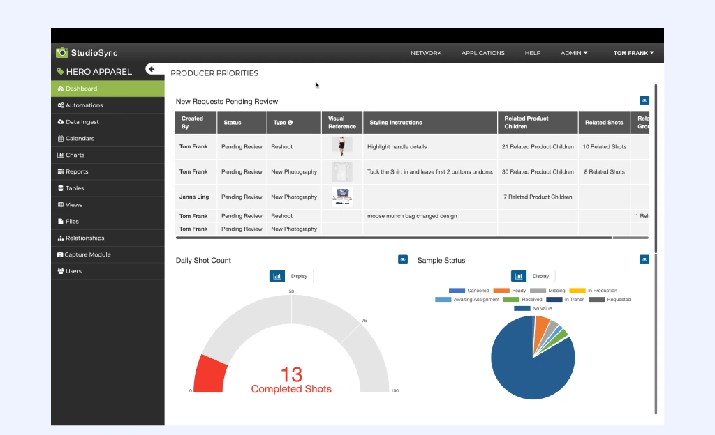
 After
After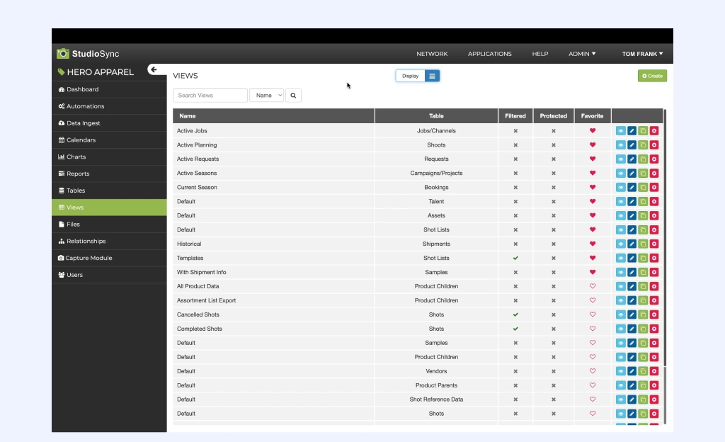
Summary
The UI improvements brought StudioSync up to modern design standards without necessitating extensive development efforts.
These strategic adjustments not only refreshed the platform's appearance but also set the stage for future design evolutions.
I was able to create a more pleasant and efficient user interface, aligning StudioSync with contemporary expectations and enhancing the overall user experience.